Scenarios and Playability
Triverse 0.8 adds training and challenge scenarios along with playability features like grid lines when building, edge panning, and radar proximity markers.
Training
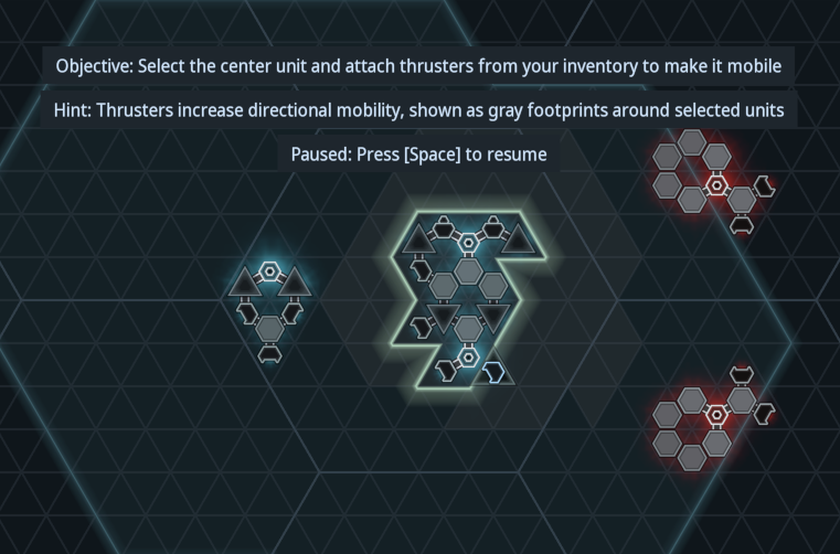
Until recently, Triverse only had a survival mode option that pushed you in the deep end and expected immediate swimming. However, Triverse is a moderately complex game with non-obvious rules and behaviors, and the UI has had a mix of commands, tools, status, and playback controls that are both overwhelming and maybe not visually distinctive enough.
The focus of this release was on making the game more approachable. Part of that is creating scenarios that incrementally teach the game rules and eventually give players challenges that require understanding the rules (or just random experimentation?). Training is especially needed when going beyond the edge of established genres or conventions.

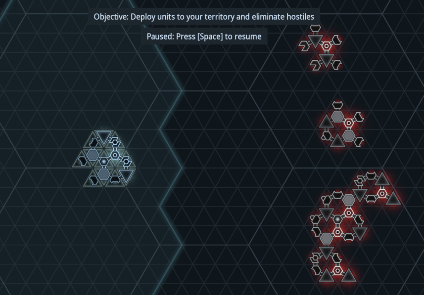
I’ve also added a sequence of challenge scenarios. For each challenge, the player is presented with a hostile fleet and must build units to defeat it given an initial amount of crystal to spend. The amount is lower than the value of the hostile fleet, so you can’t simply copy the fleet and hope for the best. The intent is to require analyzing the fleet and building your own fleet that exploits its weaknesses.

Edge Panning
Based on feedback, I’ve now added edge panning when in full screen mode (note you must toggle this with F10 currently), although now I find that I inadvertantly pan down sometimes when trying to select tools with the mouse. This could be addressed by moving the UI further away from the screen bounds when edge panning is enabled.
So now there are three ways to pan:
- WASD keys
- Middle mouse drag (not working in web yet)
- Edge panning in full screen
Proximity Markers
There are a few ways to indicate objects that are off the visible portion of the map:
- Avoid the situation in the first place by have a small enough map
- Show a minimap as part of the UI
- Allow zooming out
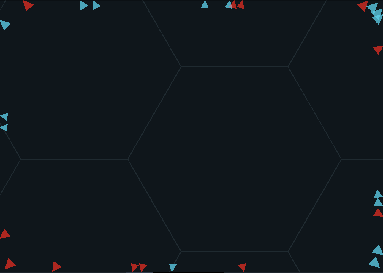
- Proximity markers around the screen
I chose to go with the last option for now because it’s easy to implement and has minimal impact on the UI. The downsides are that it adds visual clutter and doesn’t give much of a strategic view to see exactly where your forces are. I plan to prototype zooming out and a minimap at some point.

More details in full blog post
Files
Triverse
Pausable RTS with modular tri-grid units
| Status | In development |
| Author | cragwind |
| Genre | Strategy |
| Tags | 2D, artificial-intelligence, Destruction, Experimental, Sci-fi, Short, Singleplayer, Space, Top-Down, Turn-based |
| Languages | English |
More posts
- Territory and SpawningJan 20, 2023
- Melee and RepairJan 04, 2023
- Torpedo LauncherDec 17, 2022
- Salvaging PartsDec 02, 2022
- Resources and ConstructionNov 17, 2022
- EMP and Unit OrdersNov 03, 2022
- Triverse Playable DemoOct 21, 2022
Leave a comment
Log in with itch.io to leave a comment.